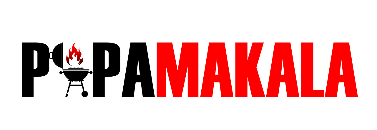
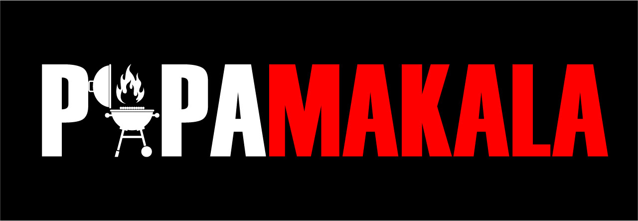
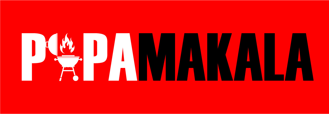
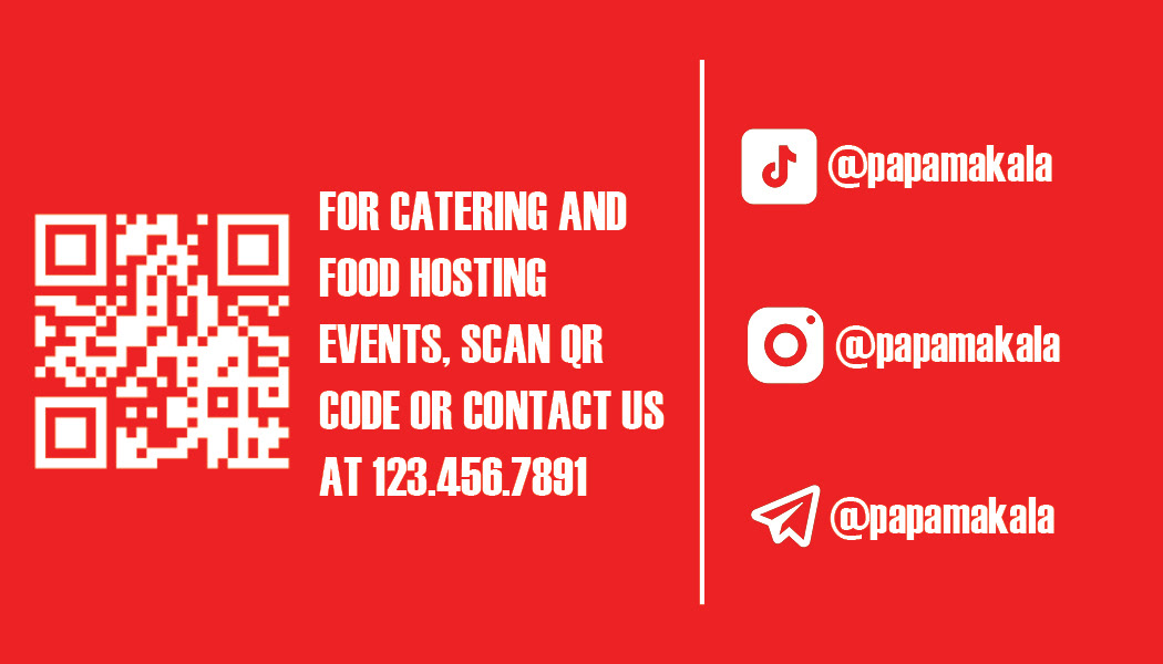
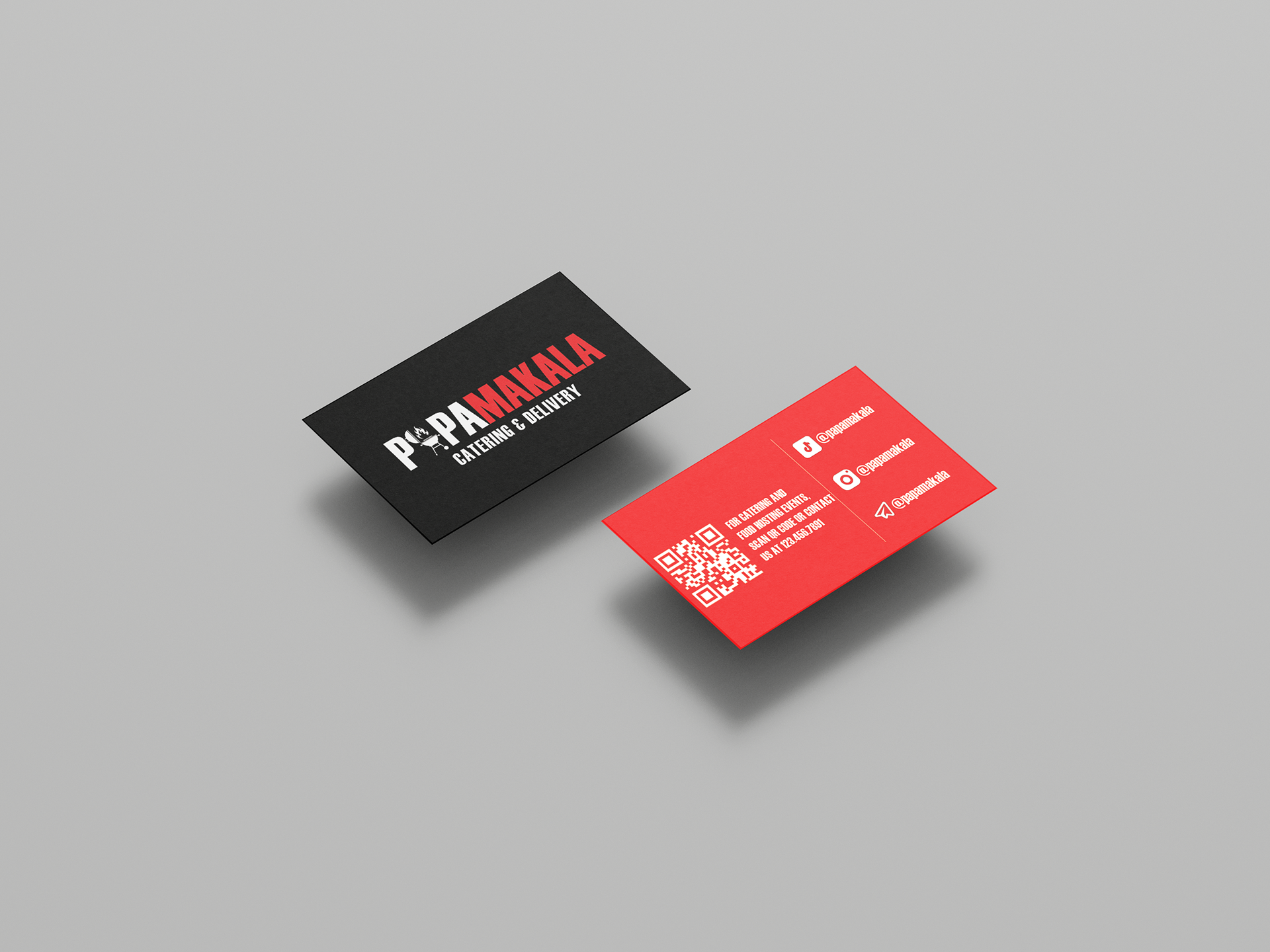
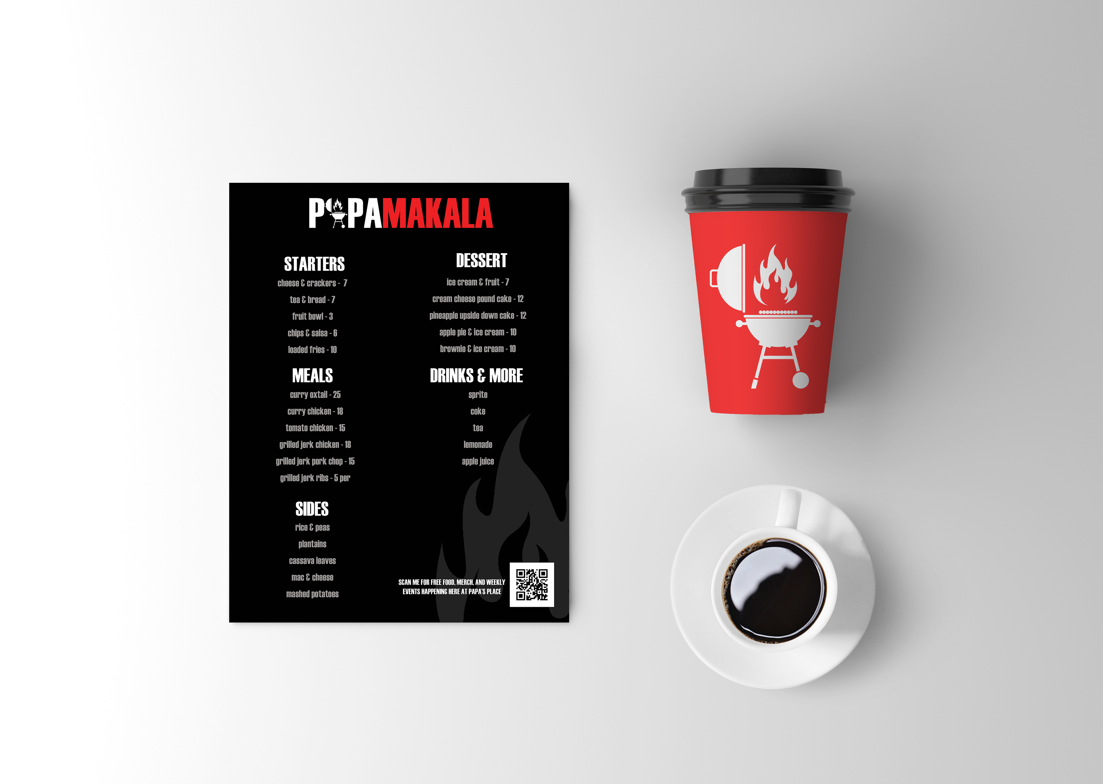
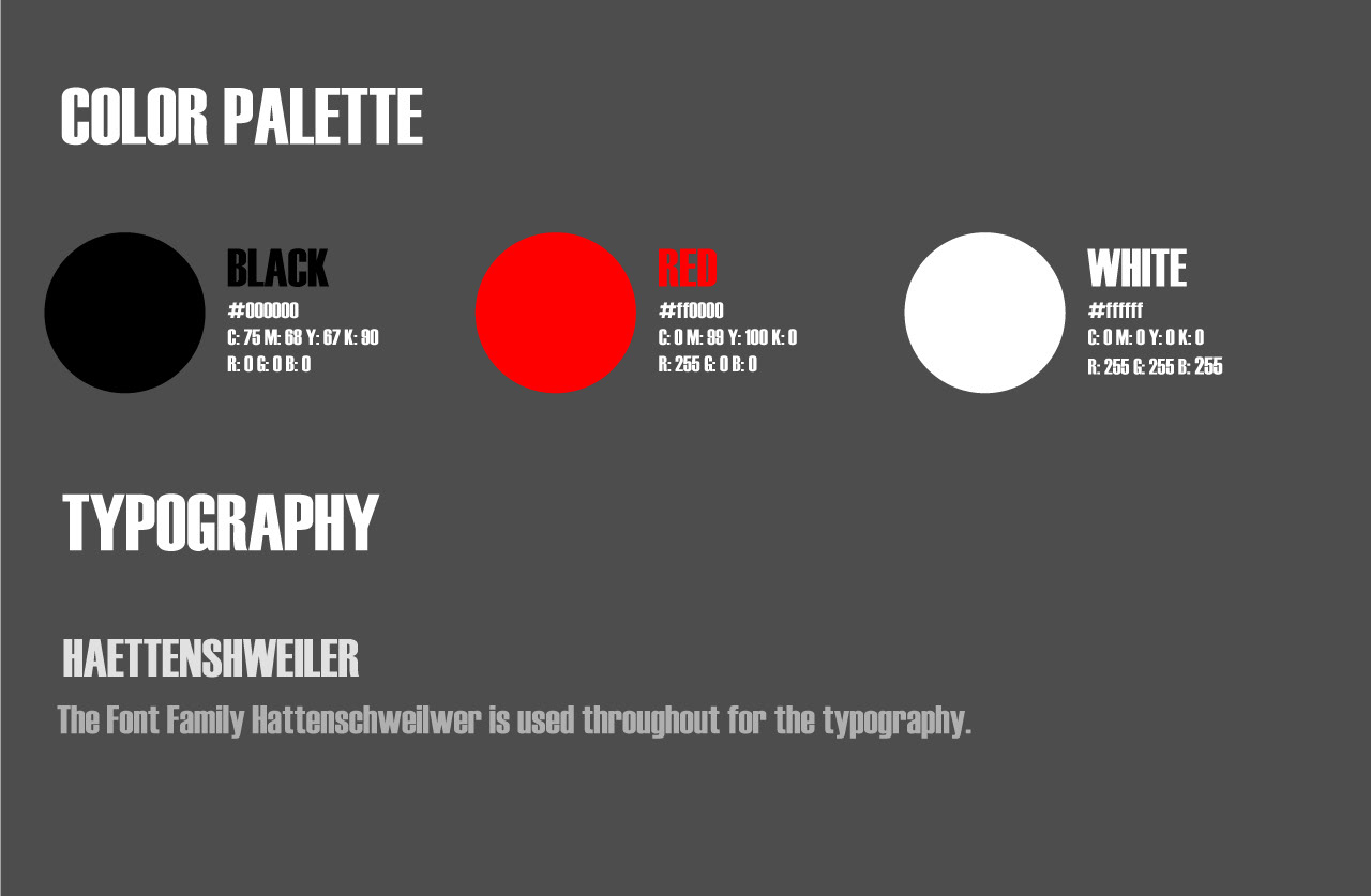
This color palette was chosen to draw attention in a simple yet very bold way. When deciding on the typography that would work well with this restaurant, I truly wanted to capture the essence and the passion of the people who make the food. Haettenscheiller was the font chosen for its eye-catching look, even letter spacing, and capital letter height. Not adding a space in between the words, but changing the color to the boldest color in the chosen palette.
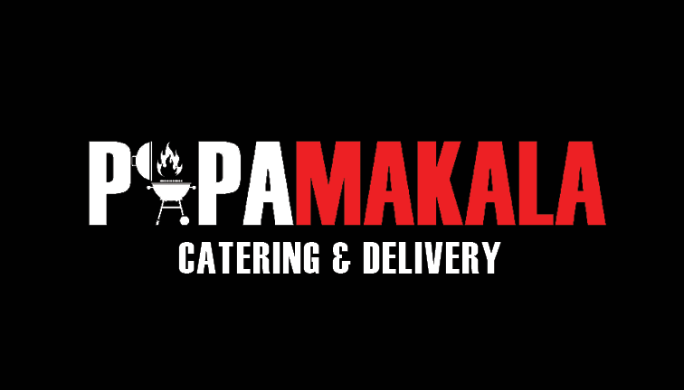
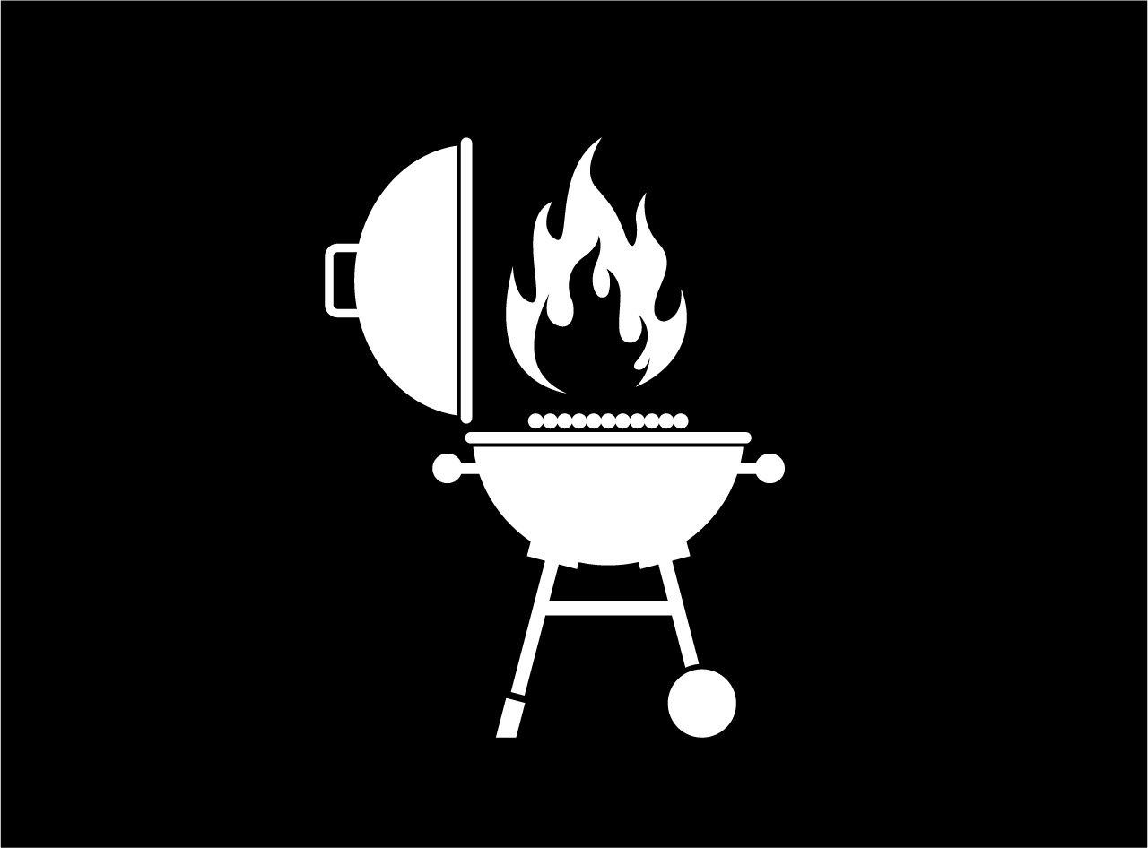
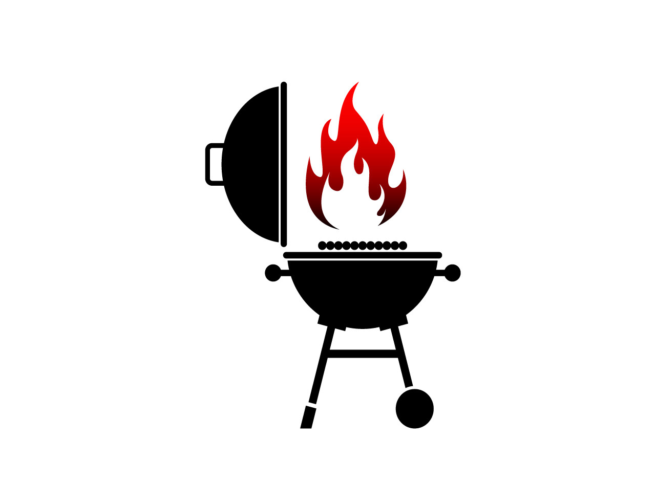
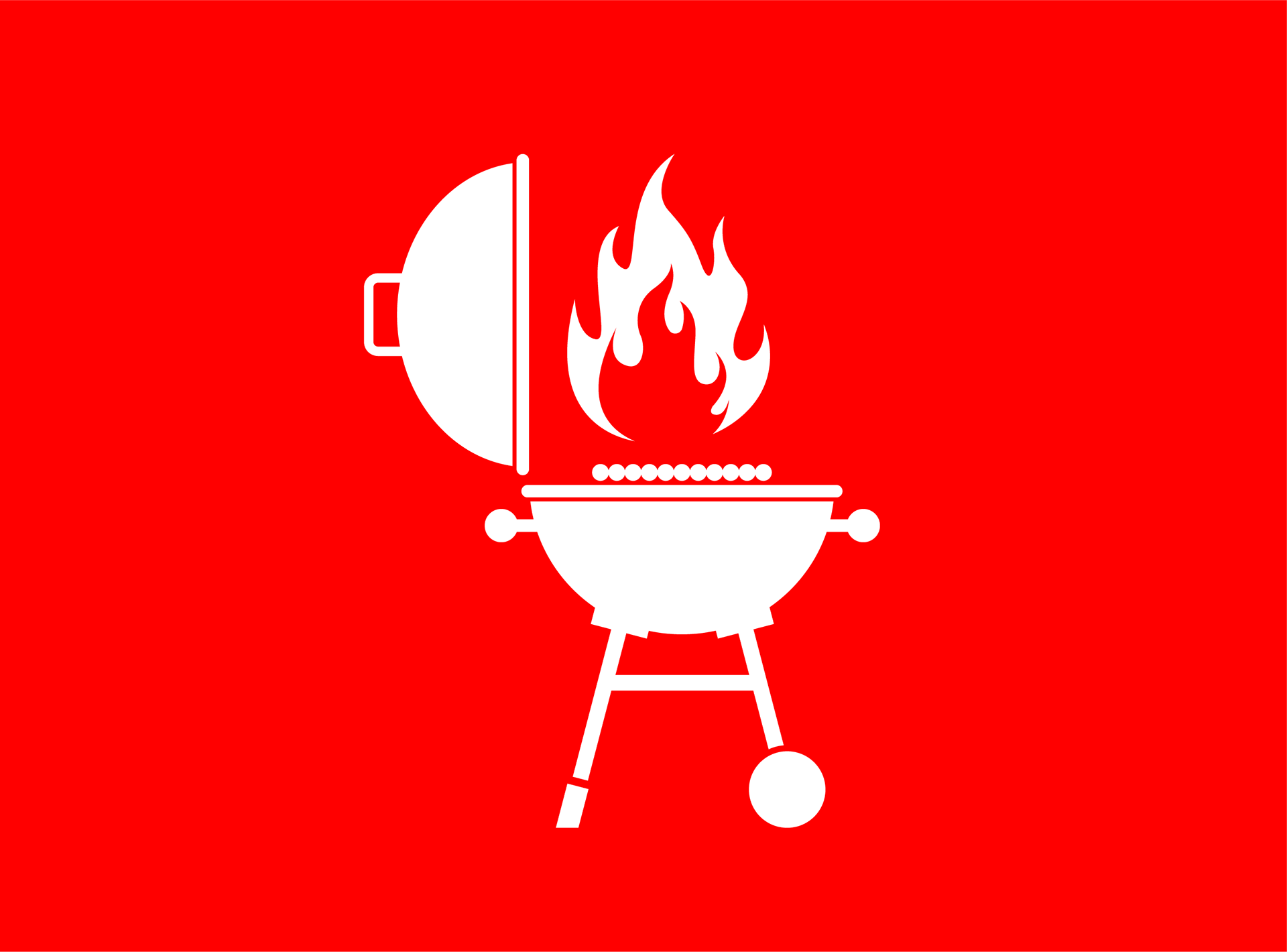
For the graphic part of the logo, there was no other option but to add a grill and fire elements as well. I went through a few iterations and ultimately chose the one you see below.
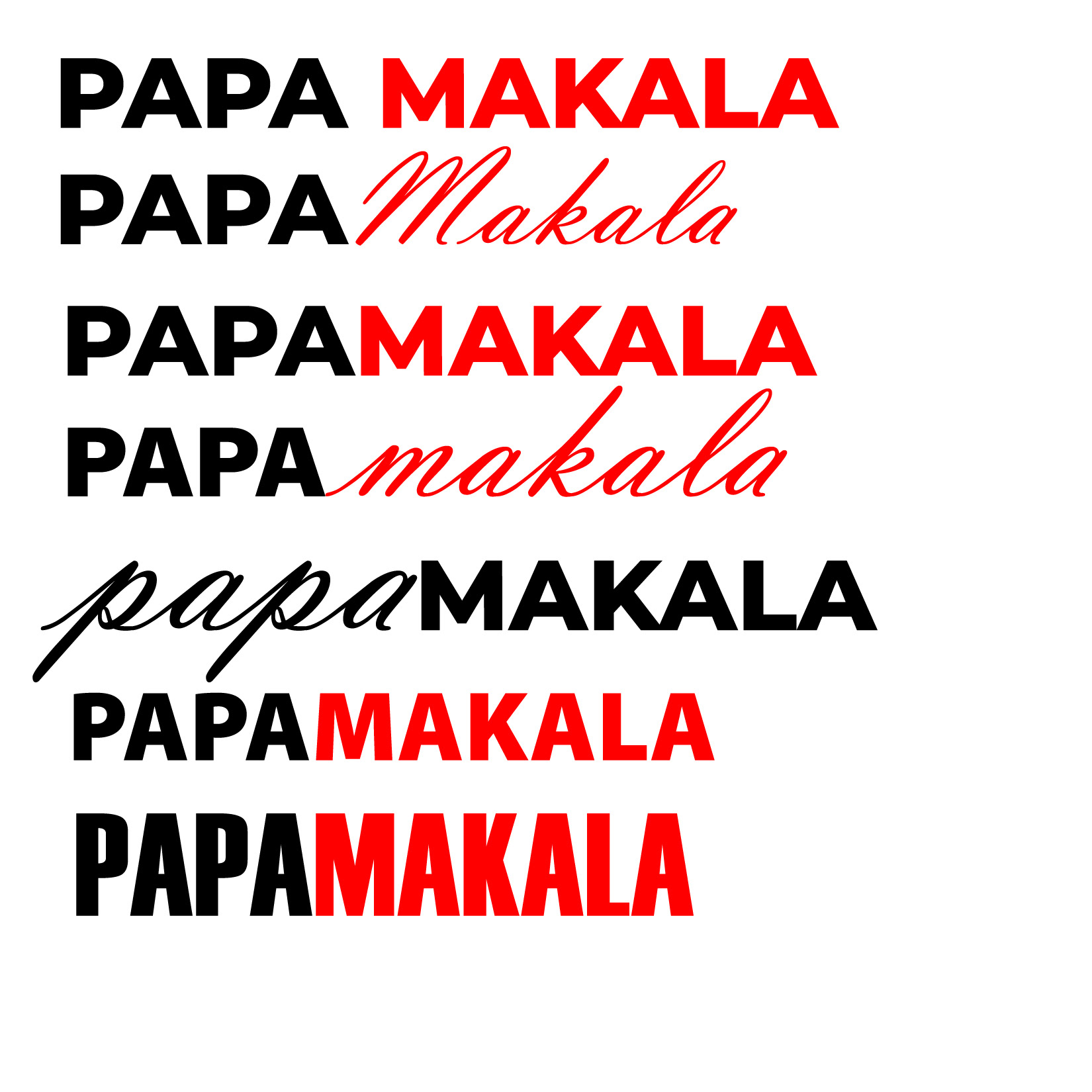
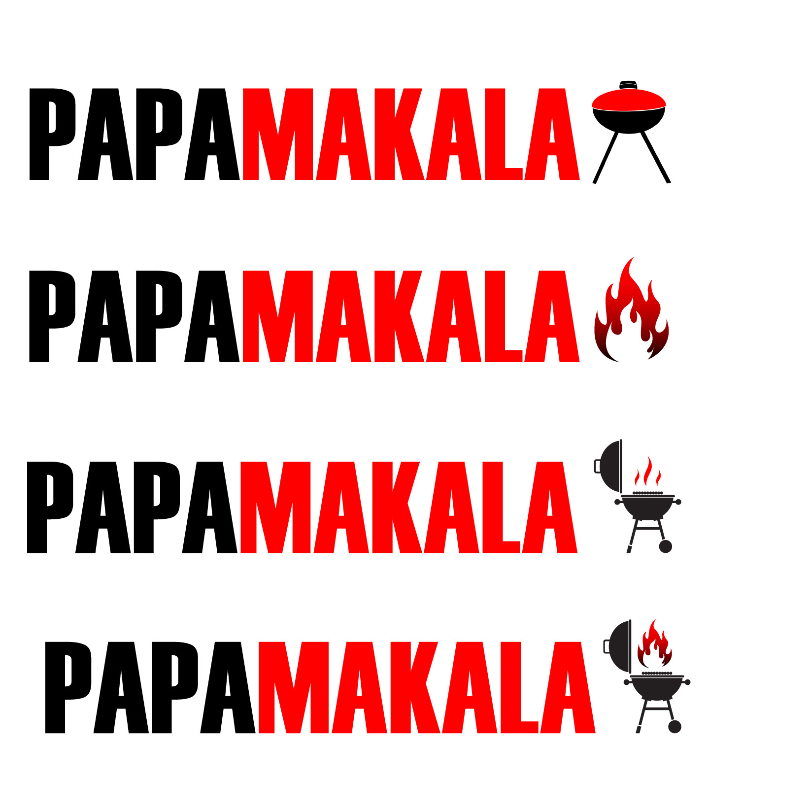
For the graphic part of the logo, there was no other option but to add a grill and fire elements as well. I went through a few iterations and ultimately chose the one you see below.
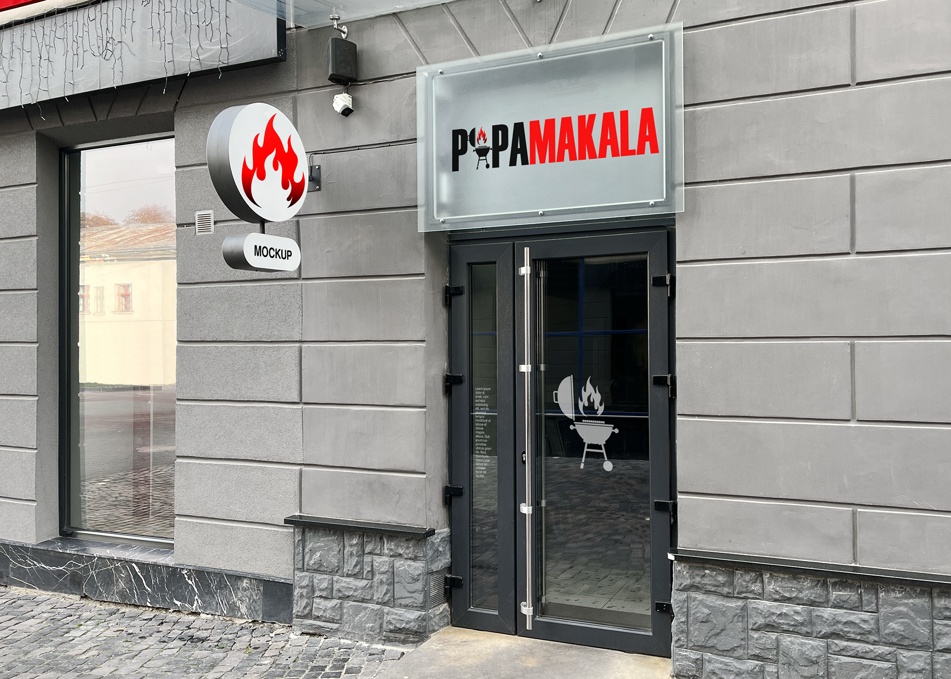
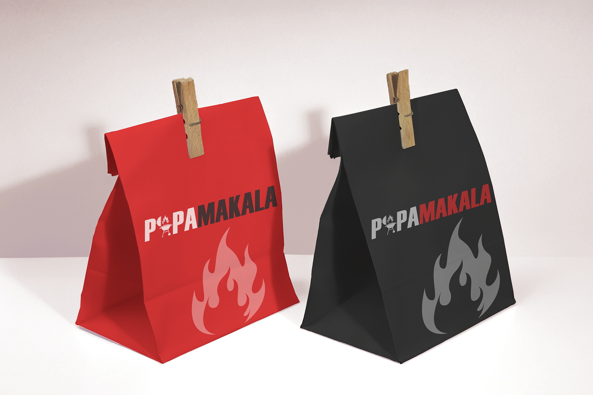
After reviewing with the client, they had the brilliant idea of adding the grill into the lettering in a way that the graphic would not simply be looked over. After a few design iterations, we chose to add the graphic as the “A” which added much more visual interest.