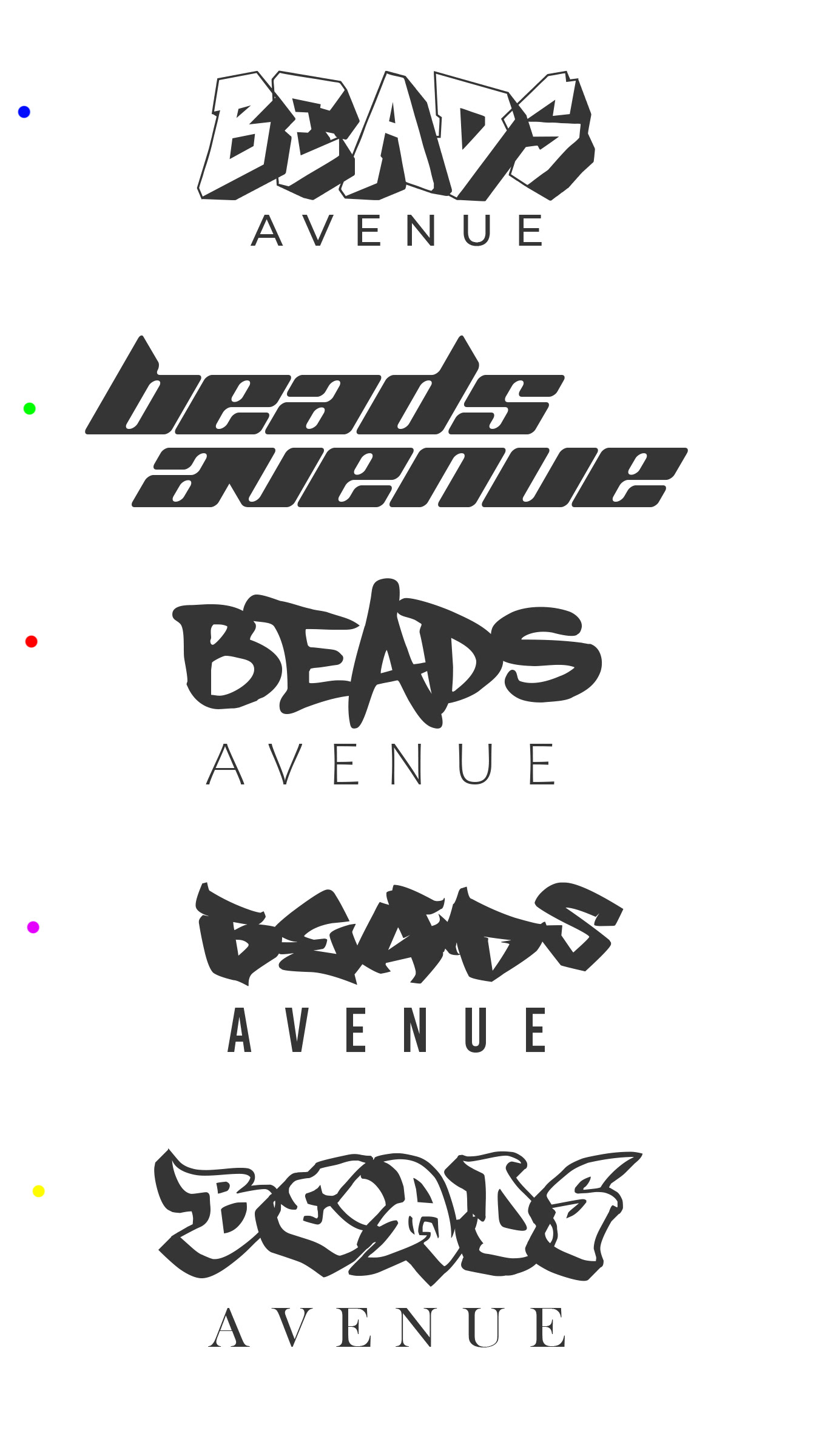
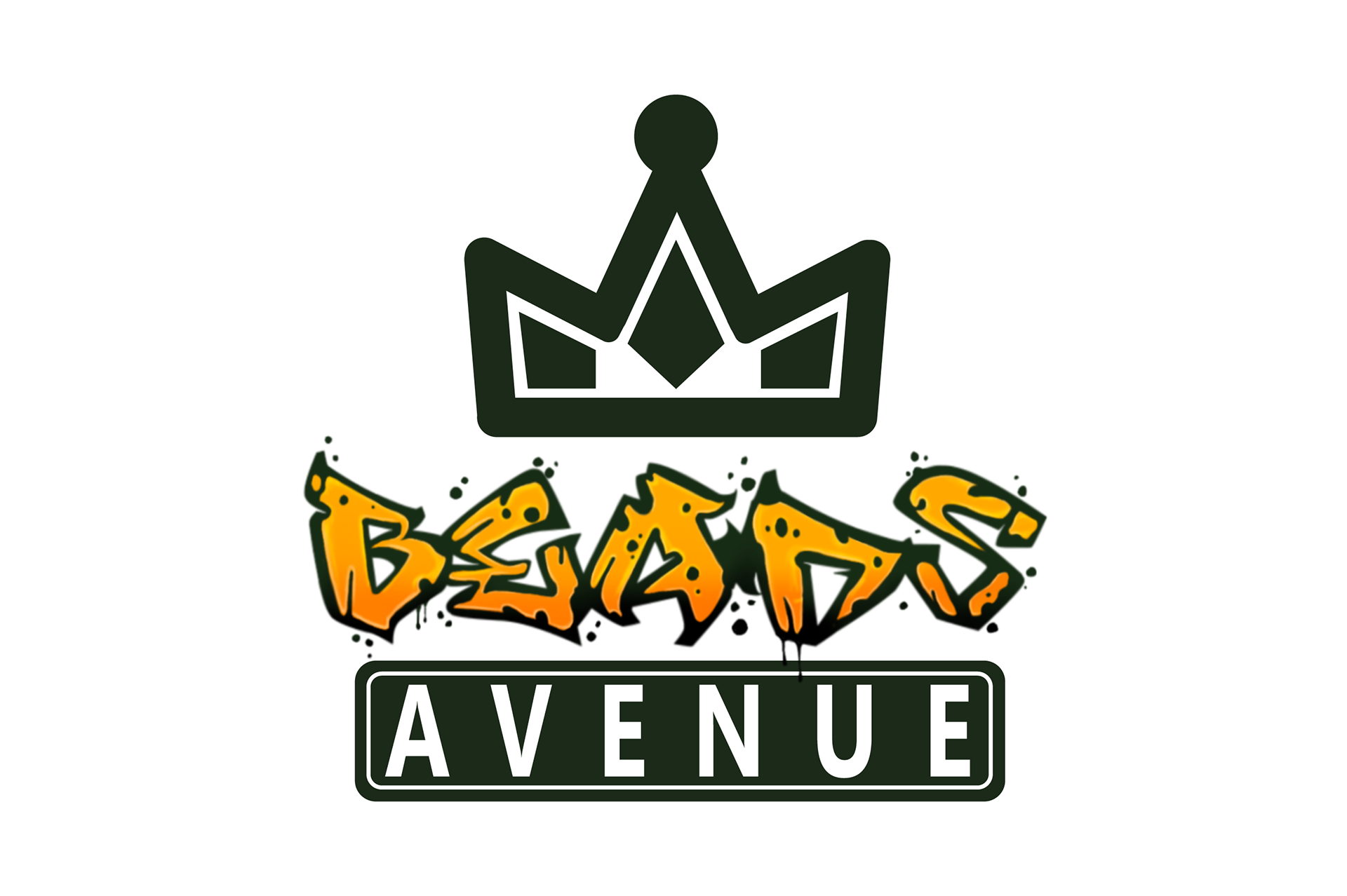
When creating this logo, the client requested a logo that represented an urban New York feel while simultaneously blending together various elements of an actual street sign. The fonts that I tested early on were various graffiti fonts that felt like they were hand-drawn.
The colors that were chosen are both warm tones of their respective hues, which gives the logo a gravitational and comfortable feel. The gradient inside the logo was chosen to add more of the urban elements of everyday New York.
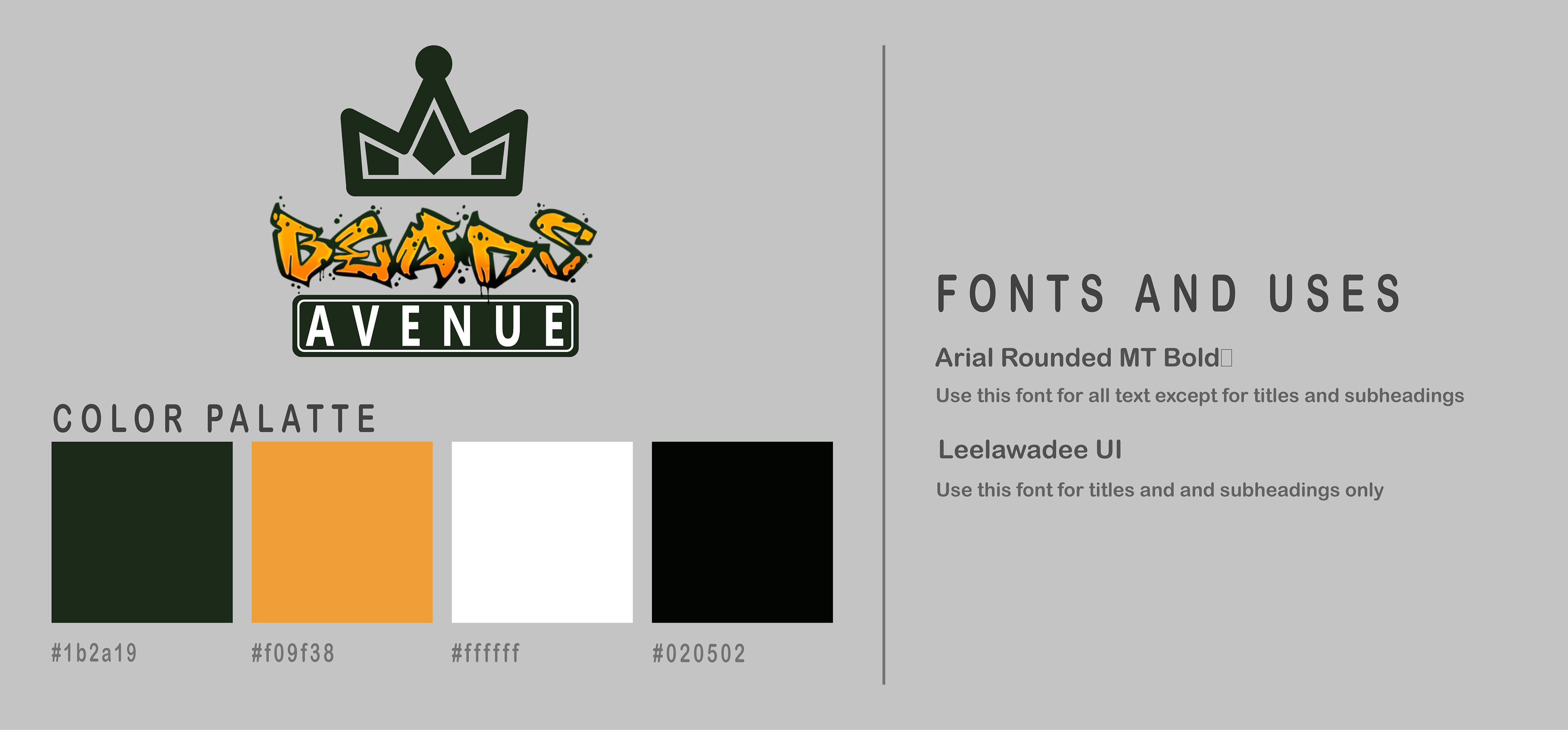
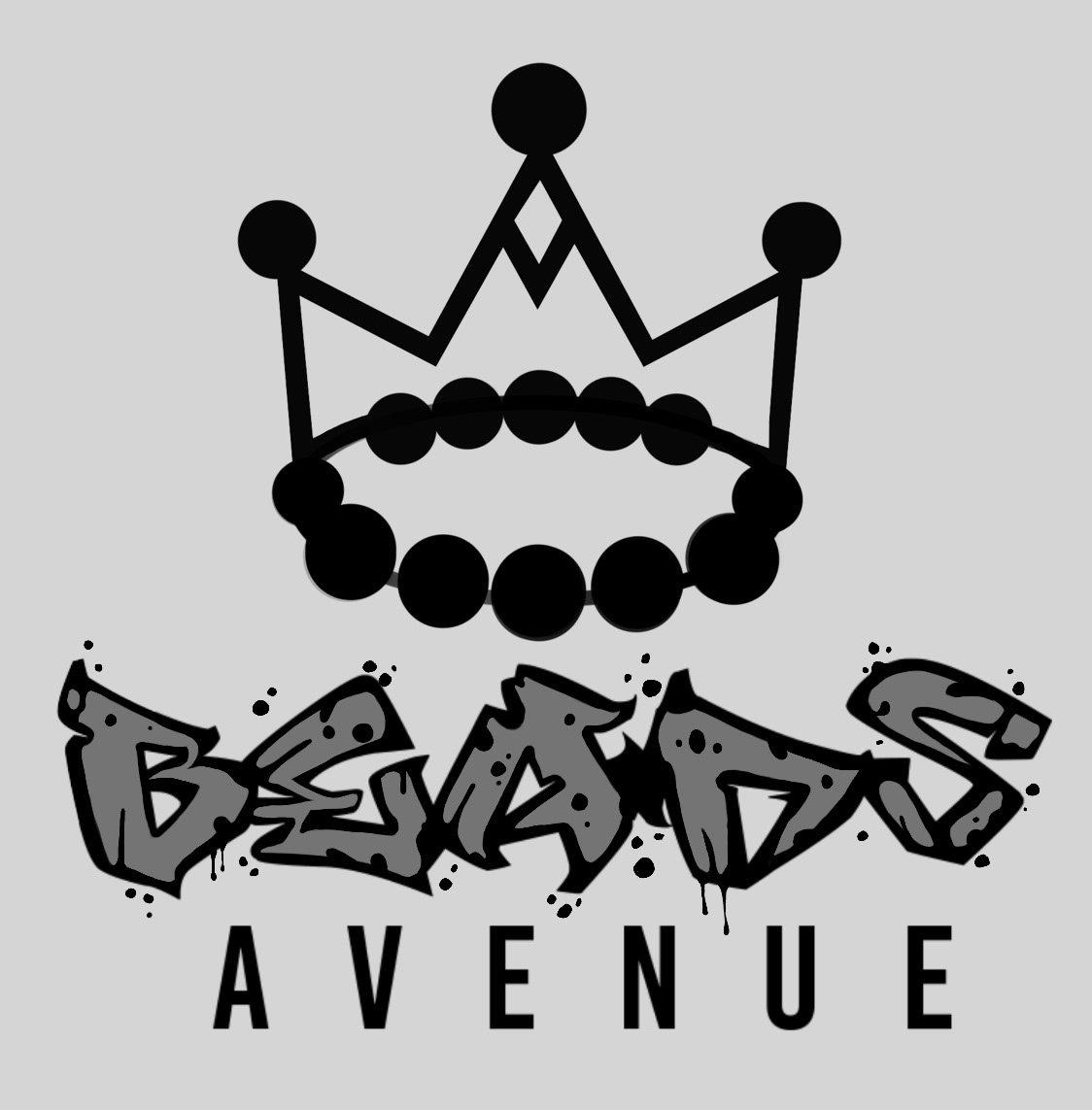
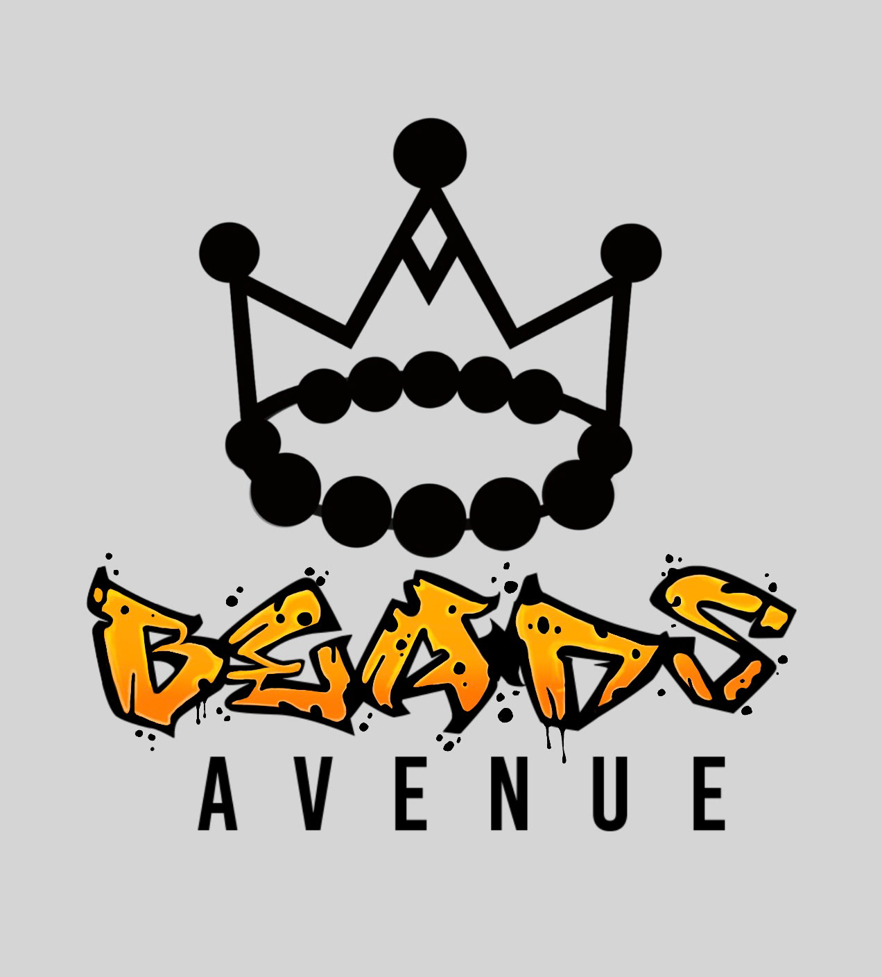
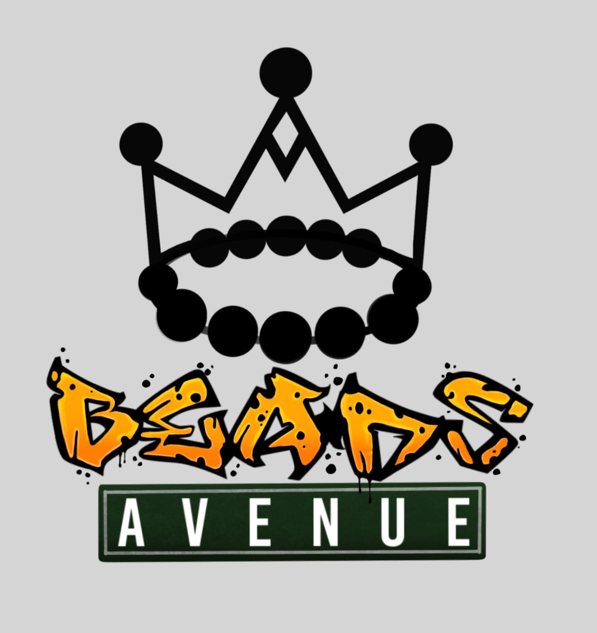
Later during this process, we decided to redesign the crown that was on top of the typography part that reads as “BEADS”. I wanted to make sure that the element of having a bead on the actual crown.


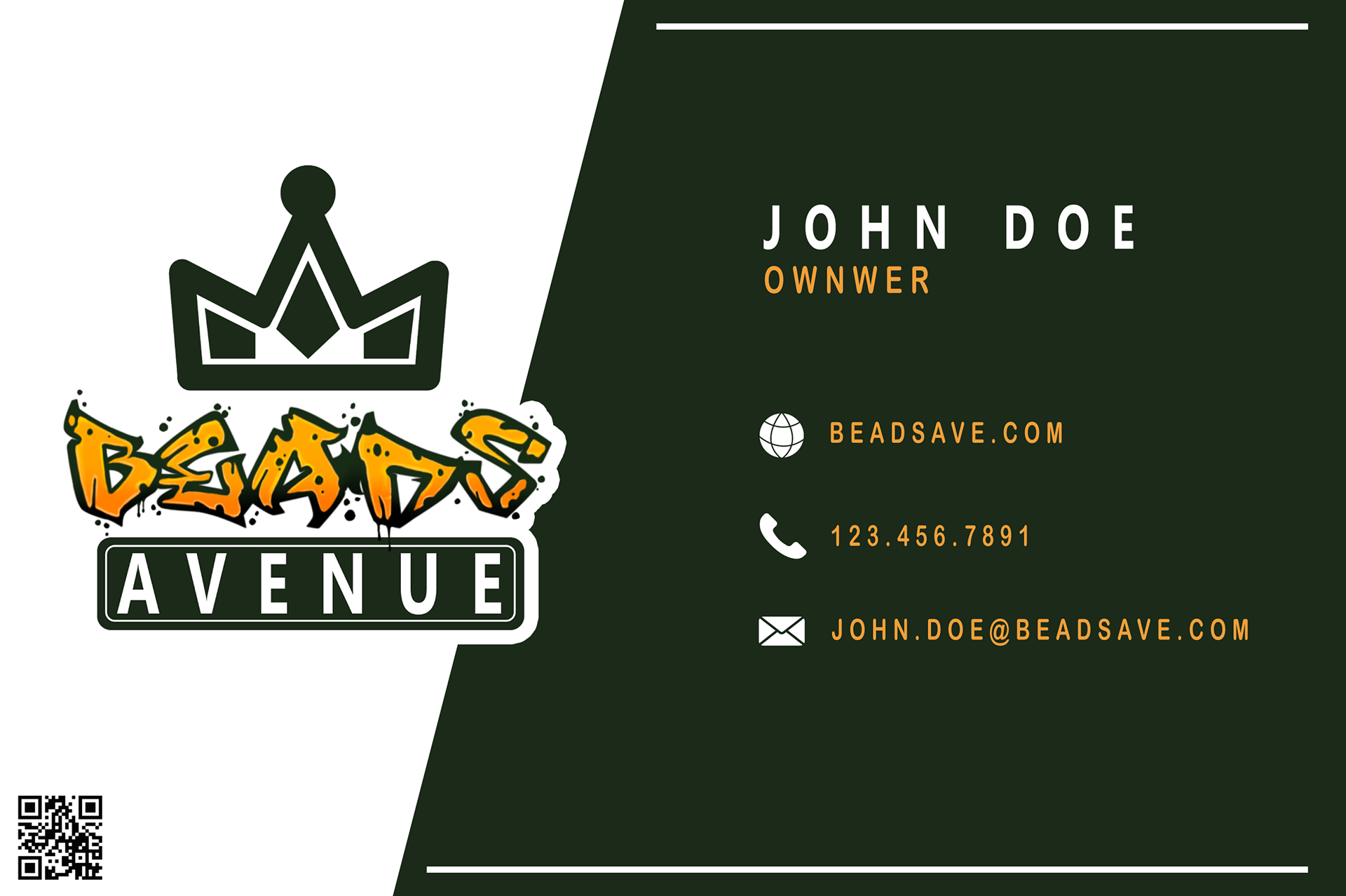
Business Card Mockups
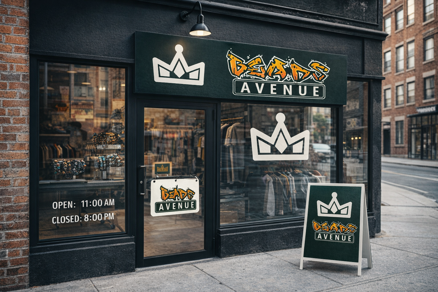
Store Front and Tag Mockups
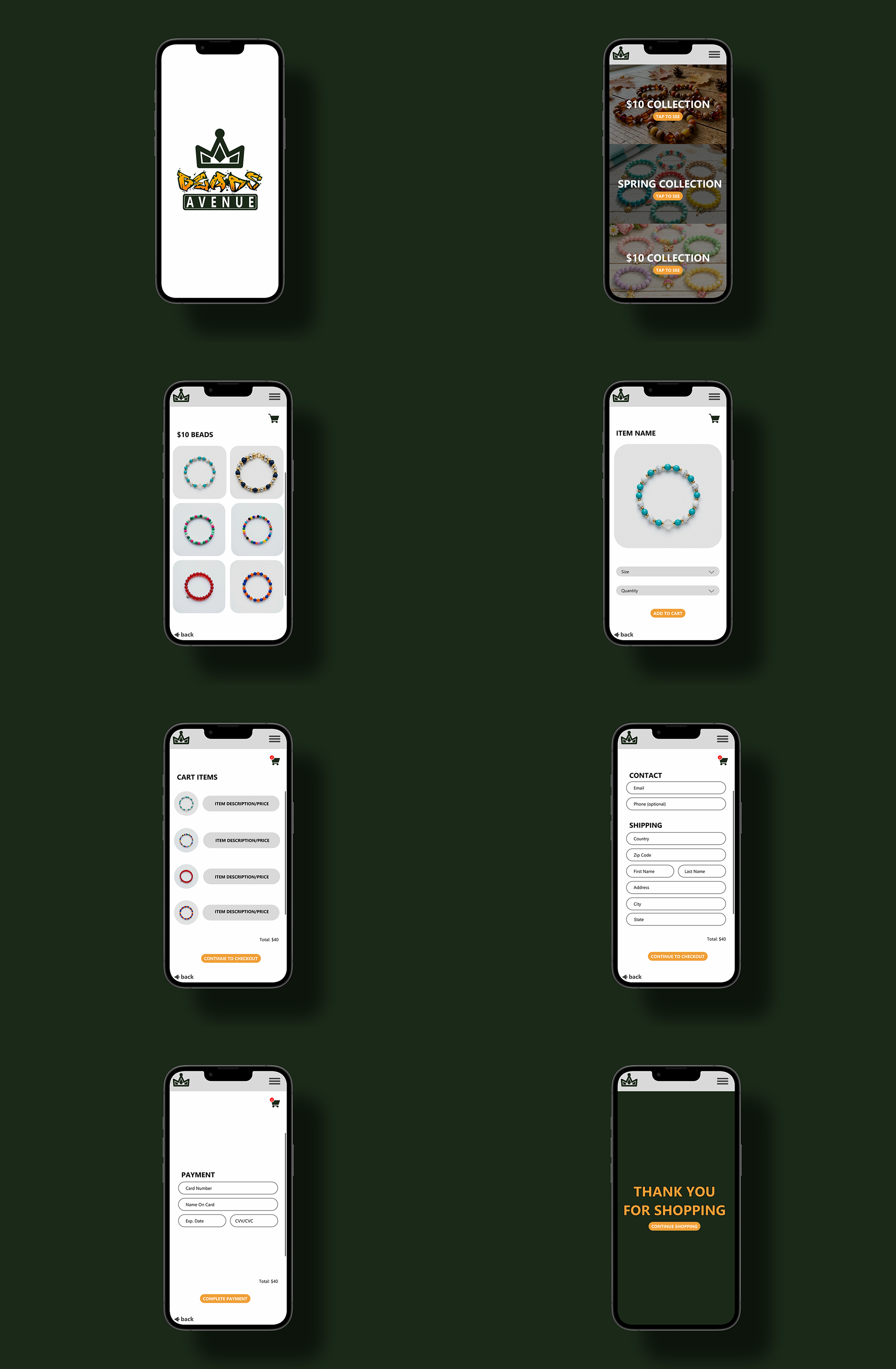
UI/UX PROTOTYPE
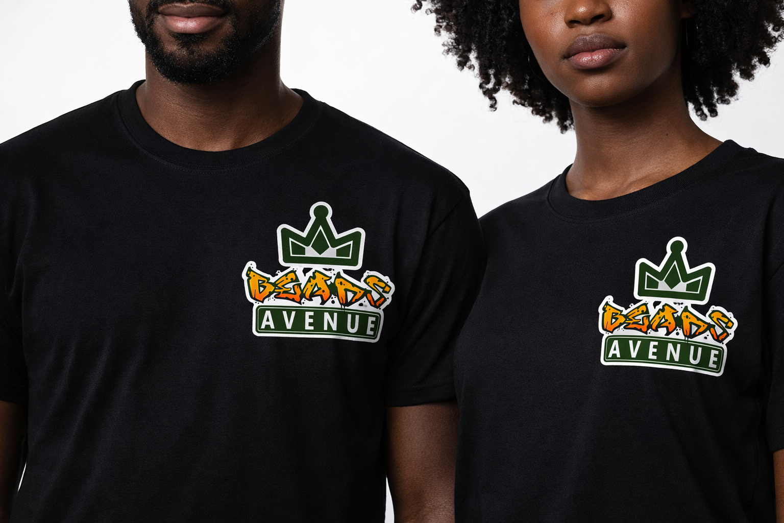
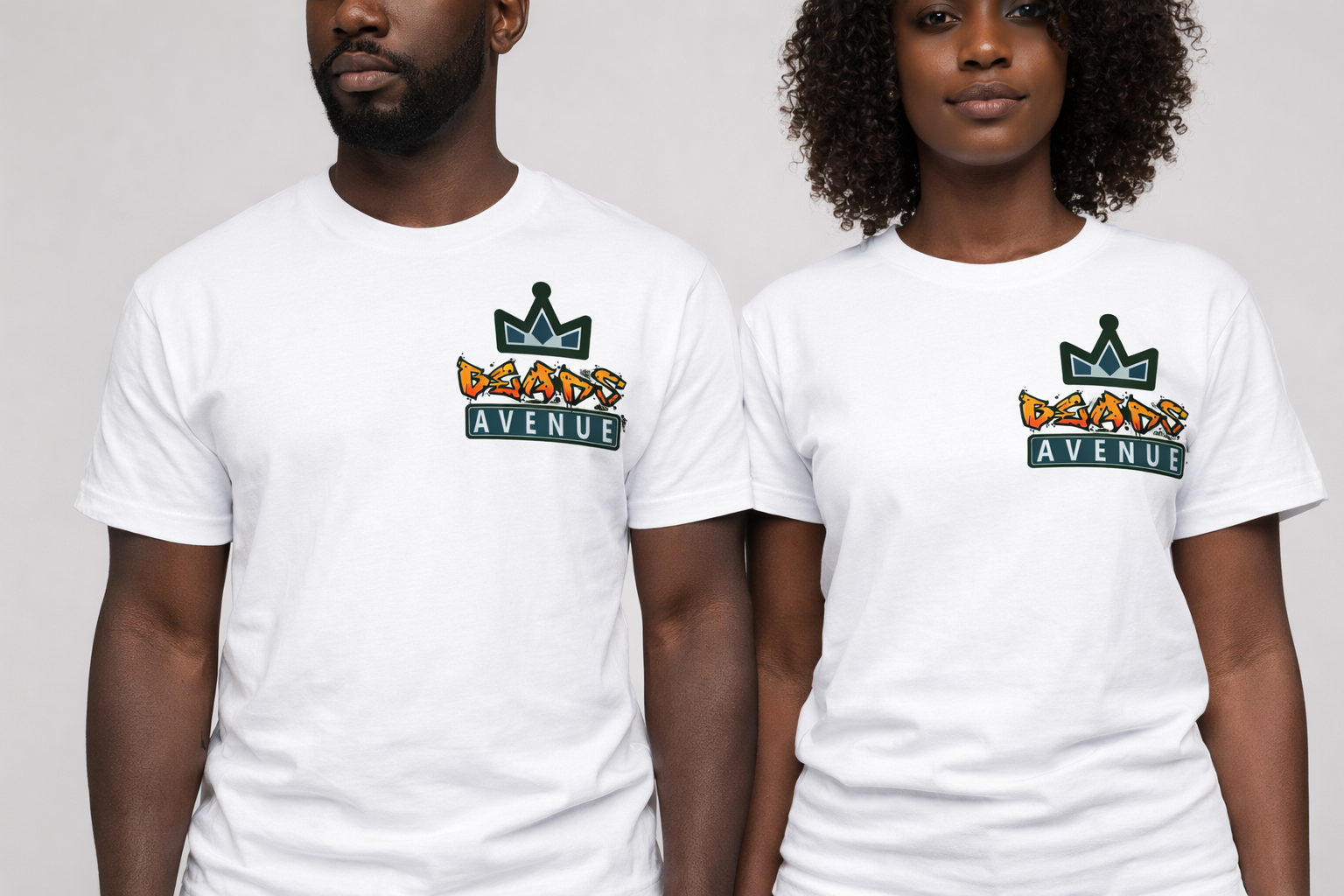
T-SHIRT MOCKUPS