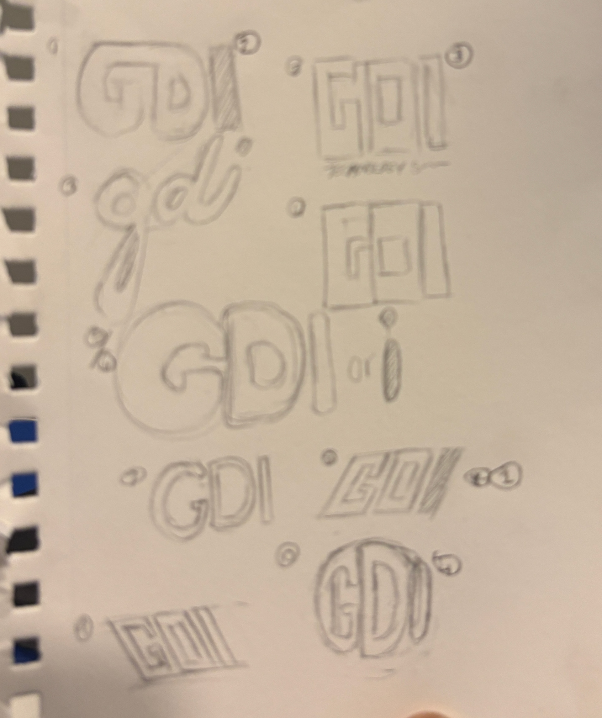
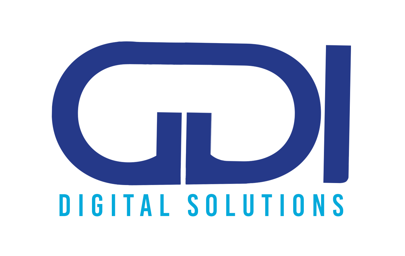
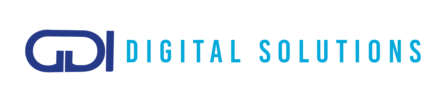
This was a redesign for a web services company previously called Lisiprota, now called GDI. When redesigning their logo, they wanted to have a similar color palette to the previous company logo. I sketched a few designs and went to Photoshop to create the initial ideas.
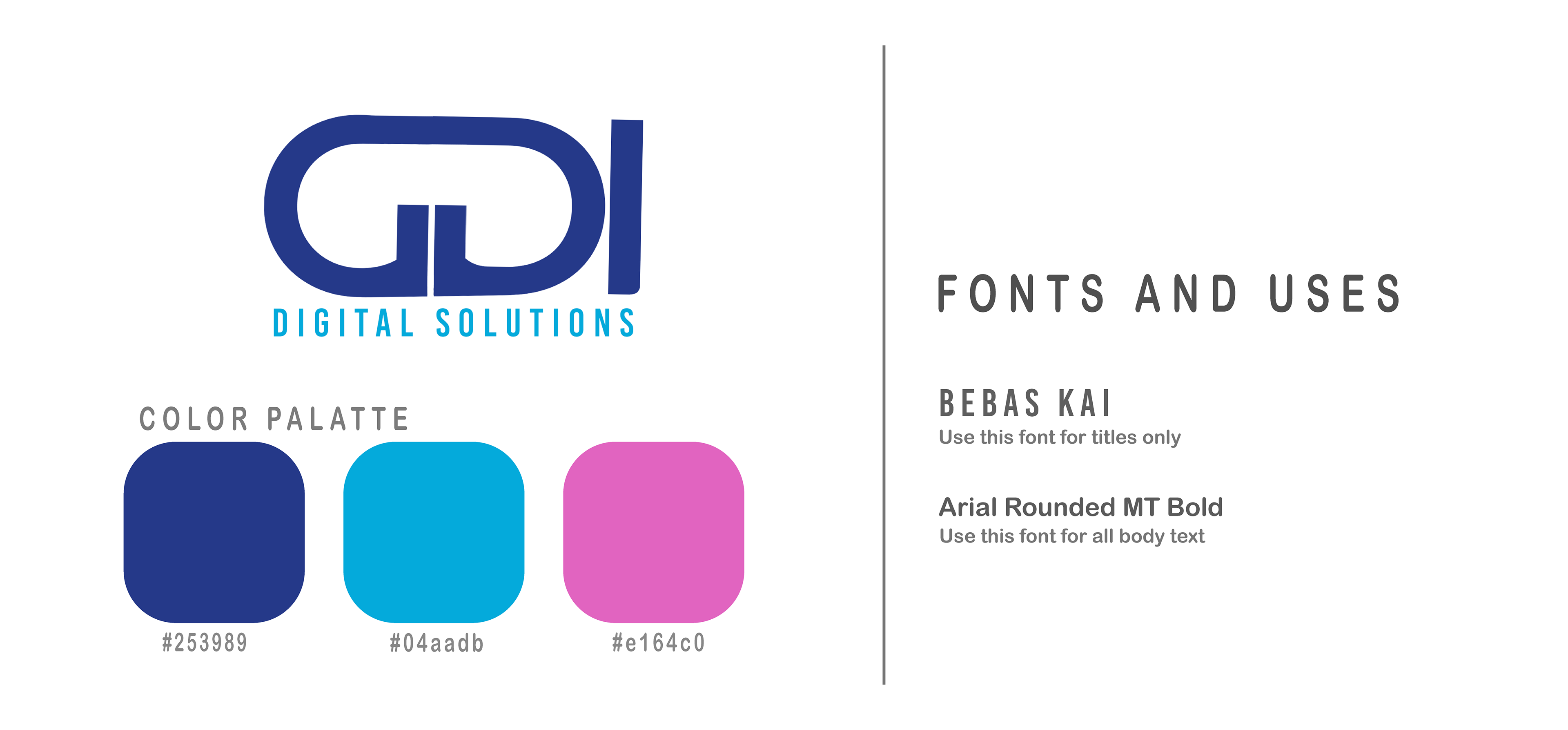

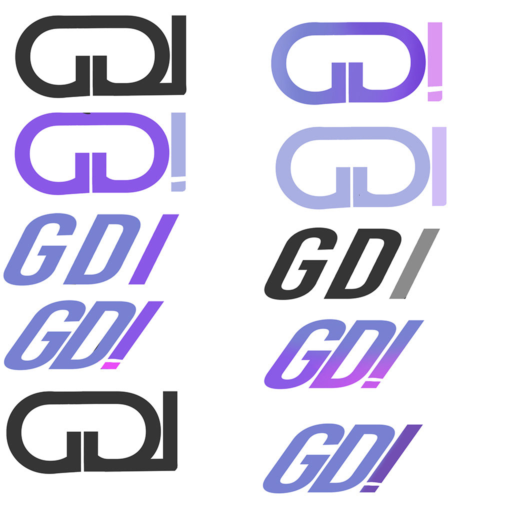
Once a design was chosen, I created a few iterations by mixing and matching different color schemes, and I met with the group. Ultimately, they chose the dark blue and light blue color scheme. This simplified the scheme to two colors in a light monochromatic scheme.


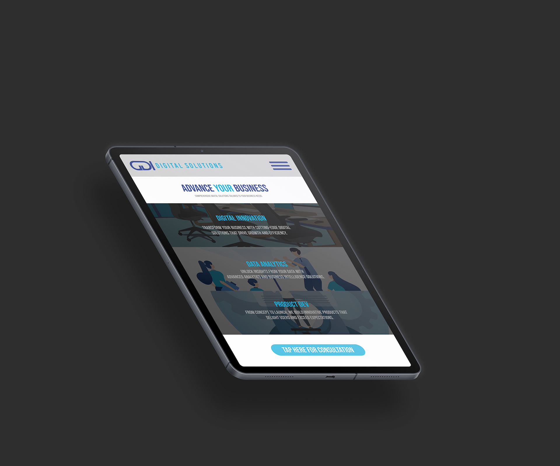
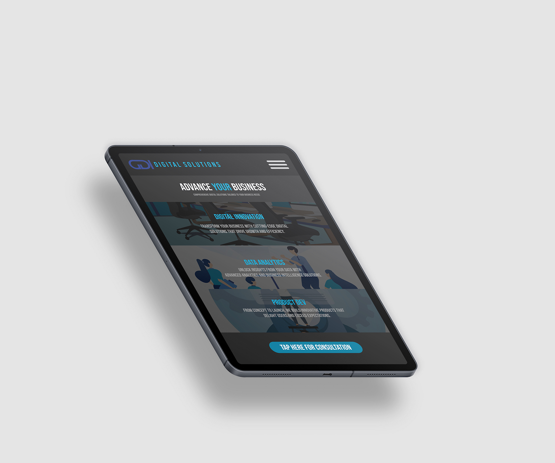
Website landing page design optimized for tablet, phone, and laptop in both dark and light modes.


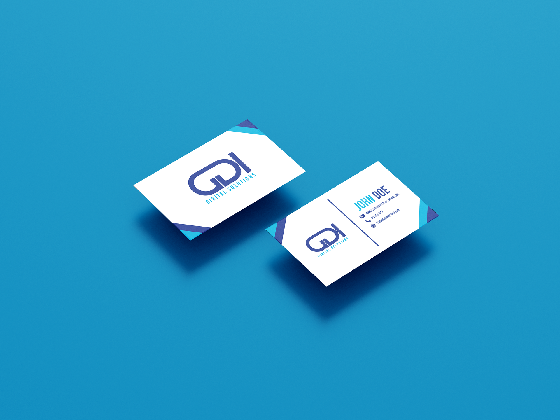
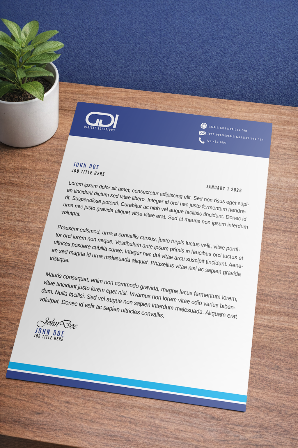
For the business card and letterhead, I wanted to create something that represented the personality of the brand and the people who run it, while also giving off a corporate feel that’s captivating.
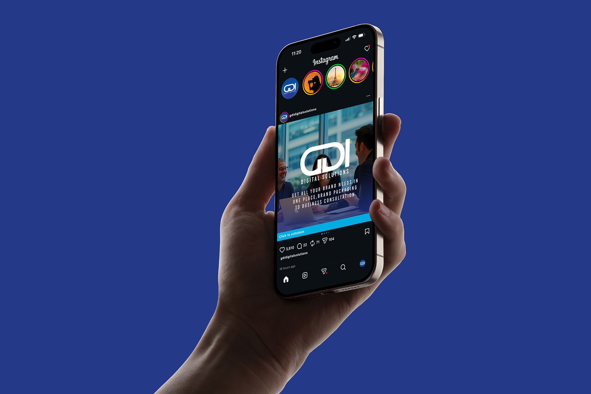
Social media ads design with a prominent CTA.